

In a world where data is everywhere, market researchers need the right tools to unearth meaningful insights from their information. Enter Dig, a powerful statistical analysis function within our Analysis & Reporting tool.
What is Dig?
Dig helps identify correlations and significance within a dataset. Using the Chi-Square significance test, it highlights categories that stand out – those that are either significantly higher or lower than the total population in your filtered data. In essence, it shows where the real action is happening.
How to Run a Simple Dig Analysis
Running a Dig analysis is a piece of cake (and might even be more satisfying!). Whether you’re a seasoned researcher or just getting started, this guide will walk you through the steps.
- Target Group Setup: Start by specifying your target group. This could be any subset of respondents that you want to explore in more detail – say, women aged 25-34, or people who prefer brand X over brand Y.
- Select Your Questions: From your list of questions, drag the ones you want to analyze into the drop area. Voilà! Your Dig analysis will pop up automatically based on your selected parameters.
- Customize Display Options: You can tweak the display options to suit your needs – whether you want to change the layout or adjust the visual styling.
- Export Your Analysis: Need to share your findings with colleagues or clients? No problem. You can easily export the Dig analysis to Word, Excel, or PowerPoint for a seamless presentation.
Now, the analysis part is done – let’s talk about how to interpret the output Dig gives you.
Interpreting the Results
Here’s where Dig really shines. The tool doesn’t just dump data on your lap, it helps you make sense of it. Each Dig report is a summary of all statistically significant findings in your dataset – and more importantly, what to focus on.
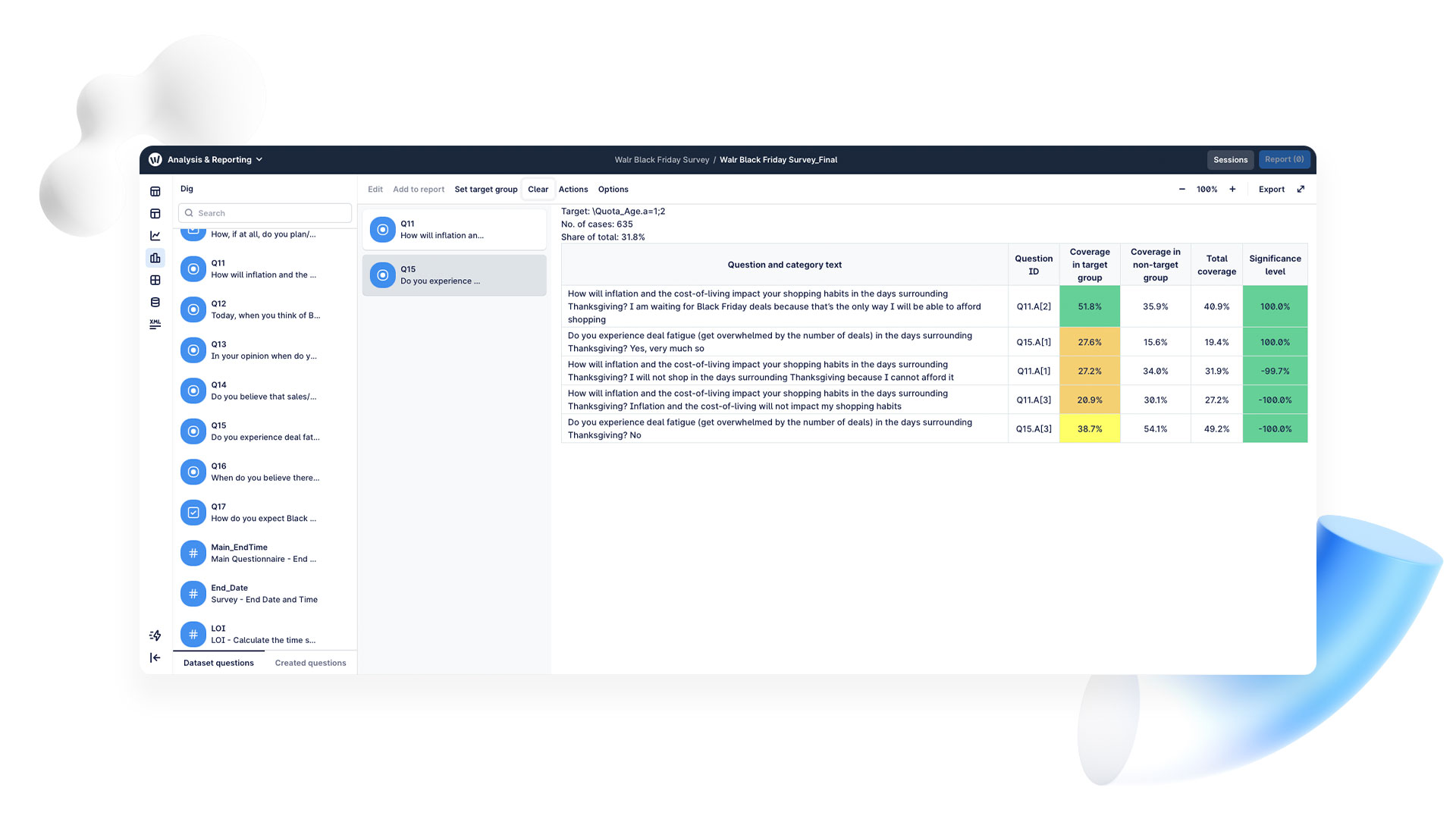
The first thing to look for is categories with both a high significance value and reasonable coverage in your target group. The conditional formatting is your visual guide: green shows what matters more to your target group, orange indicates what matters less, and yellow falls somewhere in between.
If we take the data we recently collected for Black Friday, and set the target group to be people aged 18-42, our Dig analysis will reveal that this group is much more likely to wait for Black Friday to be able to afford certain items, in comparison to their older counterparts. They are also less likely to experience deal fatigue than the non-target group of people aged 43 and above.
While we at Walr don’t generate insights, the visual cues provided by Dig make it easy to understand what your results are telling you.
Practical Tips for Getting the Most Out of Dig
- Be Selective: With so much data at your fingertips, it’s easy to get lost. Focus on the categories with the highest significance and those that cover a reasonable portion of your target group.
- Experiment with Different Groups: Don’t be afraid to play around with different target groups. Dig’s flexibility lets you explore a wide range of correlations.
- Use Visual Cues: Rely on the color coding in the results to quickly spot what matters most to your target group.
In short, Dig not only simplifies the analysis process but also gives you the power to see what really makes your audience tick. If you want to turn raw data into actionable insights, book a demo of our Dig function with one of our experts today.